Colorwork & Contrast
Posted by Maya Gooding on Mar 15th 2022
Understanding what colors will offer you high or low contrast is important in any project that uses two or more colors or yarns.
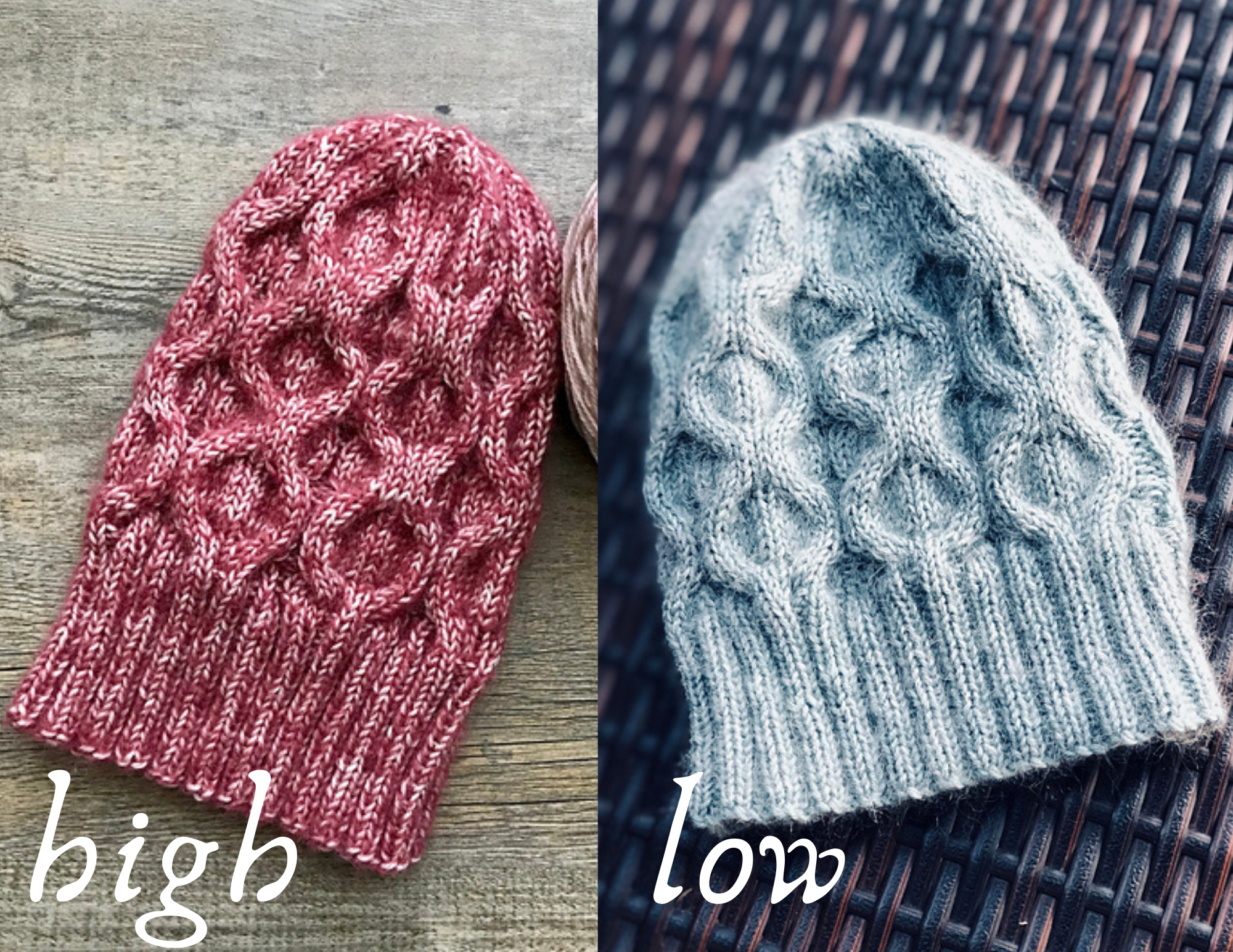
High contrast: An example of this is black and white. Since you have two extremes of light and dark, one paired with the other will always stand out very clearly. I like to think of high contrast as bold and graphic – like Pop Art.
Low contrast: An example of this is blue and purple, in a similar shade or tint. Since you have two similar colors, neither will stand out significantly from the other and will have a blended effect. However, if you had different shades or tints (navy paired with a lavender), you could achieve much higher contrast. I like to think of low contrast as soft and muted – like Impressionism.
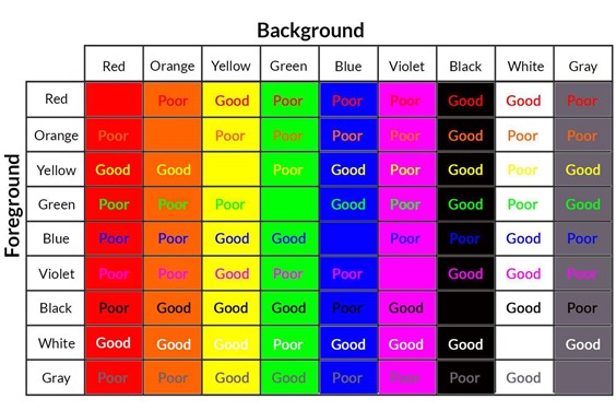
Essentially, the more similar your colors are, the less contrast you will have. The more different, the higher contrast you will have.
But sometimes, it is difficult to tell the difference between what will have low or high contrast when we aren’t working with extremes in shade or tint. This is where tone comes in. To our eye, a combination of orange, gray, green and purple looks obviously different. We would guess that we have high contrast, since none of those seem similar in any way. But what is harder to see is tone, which can affect our contrast significantly.
One trick I have for checking tone is to take a picture of our color choices (it doesn’t have to be a beautiful picture – just one where you can clearly see all your colors next to one another!) and then filter that photo into black and white, which can easily be done on any smartphone. When colors are shown this way, it becomes much easier to tell the difference between them and note what offers high or low contrast.
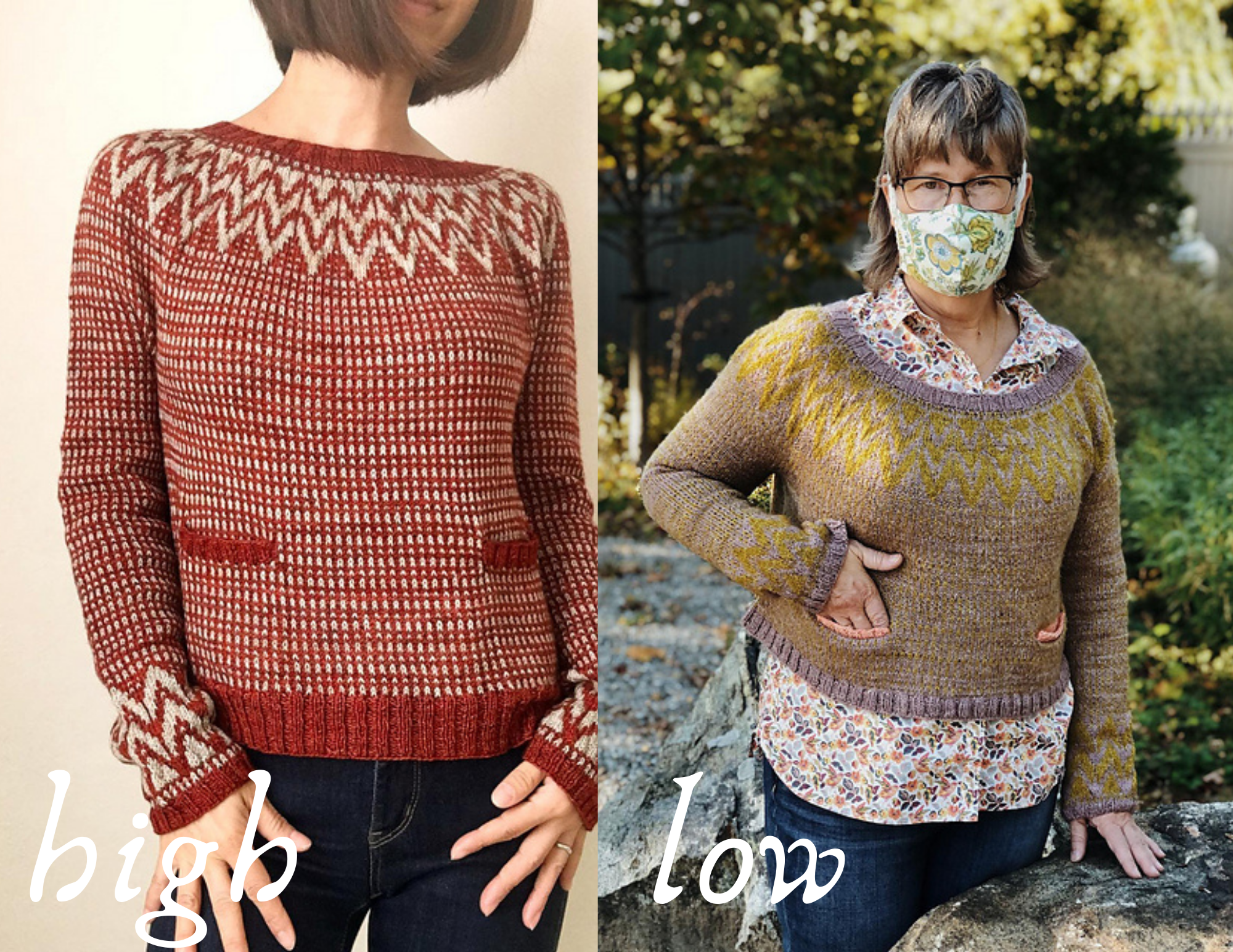
And as it turns out, Andrea Mowry's designs offer great examples of high in low contrast in all styles of colorwork knitting! Designs featured are: Sparky for stranded colorwork, Shifty for mosaic knitting, The Daily for stripes/colorblocking, What the Fade?! for fading, and Minted for holding yarns together/double.
Stranded colorwork: In stranded colorwork, colors will overlap. You are creating a motif with a background, and what colors you choose are important for having a motif that is clearly visible (high contrast) or more subtle (low contrast). Color dominance (where you hold your yarn when working these motifs) is equally as important in creating contrast between the motif and the background.
In colorwork patterns, your background is usually your Main Color or “MC”, and you can have any number of Contrast Colors or “CC”’s.
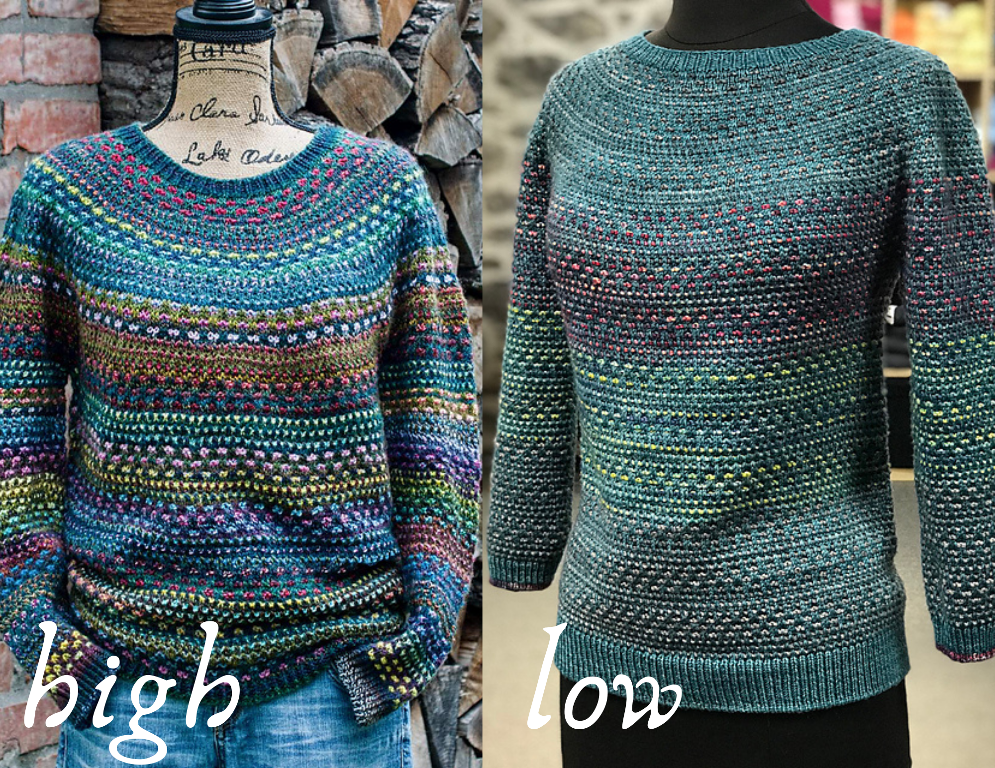
Mosaic: In mosaic knitting, colors will overlap. In certain designs you create a type of motif, like stranded colorwork, that you may want to stand out with high contrast. In other designs, like the popular Shift collection by Andrea Mowry, you are just creating an overall texture, in which you may want more of a blended, low contrast watercolor effect.
Stripes or colorblocking: With stripes and colorblocking, colors will not overlap, but will sit next to one another. How much contrast you have between these 2+ colors will determine how “stripey” your piece will look. If you choose low contrast, you may barely notice the stripes, and it may almost look like you just used different dye lots of the same color. If you are using more than 2 colors, you should also plan out your placement ahead of time, so that you create an even level of contrast throughout and you don’t end up with large chunks of color that look like wider stripes than the others because of too low a contrast.
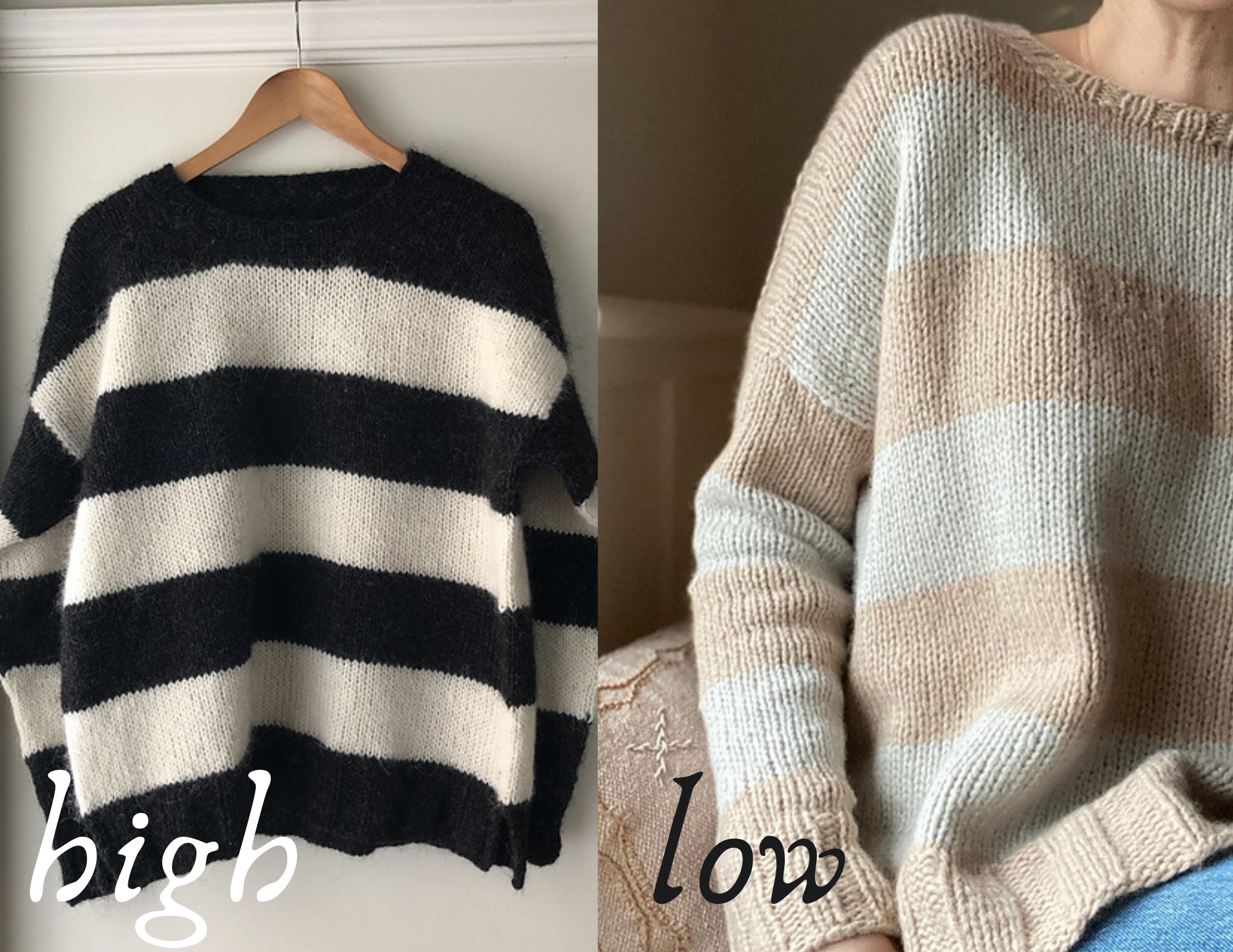
Fading: With this type of yarn blending, you will want to decide ahead of time what type of overall look you are going for. If you want colors to smoothly transition a fade, having low contrast from one color to the next will give you a smoother fade. High contrast will give you more of a colorblocked or striped look, with clear delineation of when one color changes to the next.
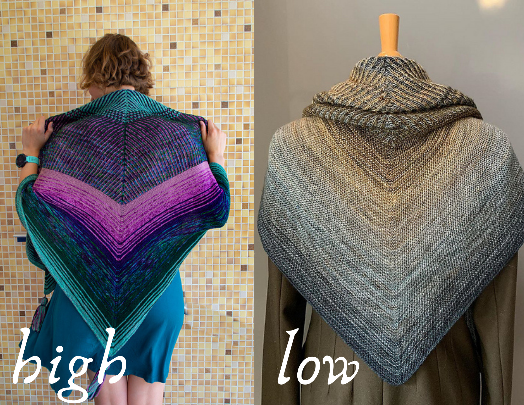
Holding yarns together/double: With this type of combination, you will want to decide ahead of time what type of overall look you are going for. High contrast combinations will give you a marled, or “tv static” effect. Low contrast combinations will give you a much softer marl, and potentially an overall completely different color to the yarn in total.
